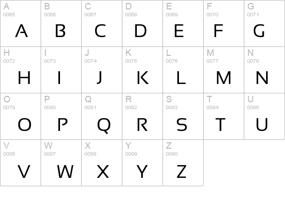
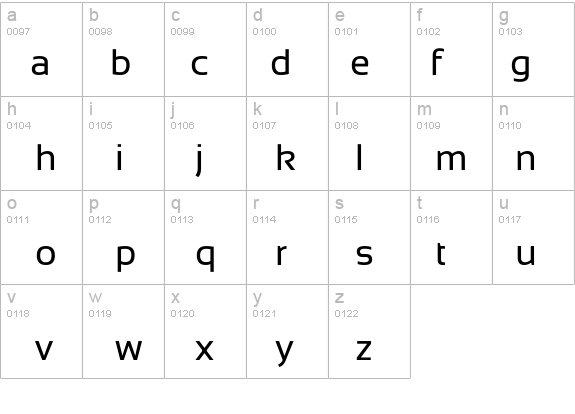
Sansation Regular

License:
Free
Author's note:
Basic font information Copyright notice © 2008 Bernd Montag - feel free to distribute - feel free to use personal and commercial - read attached textfile for restrictions Font family Sansation Font subfamily Regular Unique subfamily identification Sansation - © 2008 Bernd Montag Full font name Sansation Regular Name table version Version 1.0 Postscript font name Sansation Regular Manufacturer name High-Logic Designer High-Logic - Erwin Denissen 1999 Description Template Extended font information Platforms supported Platform Encoding Microsoft Unicode BMP only Macintosh Roman Font details Created: 1999-08-30 Revision: 1 Glyph count: 513 Units per Em: 2048 Embedding rights: Embedding for editing allowed Family class: No classification Weight: Semi-light Width: Medium (normal) Mac style: Bold Direction: Only strongly left to right glyphs + contains neutrals Pattern nature: Regular Pitch: Not monospaced Visual characteristics Family type: Latin (text and display) Serif style: Any Arm style: Any Letter form: Any Weight: Various Proportion: Any Contrast: Any Stroke variation: Any Midline: Any X-height (corpus size): Any Complete pack contains6 font weights listed below: Sansation_Light.ttf Sansation_Bold.ttf Sansation_Regular.ttf Sansation_Bold_Italic.ttf Sansation_Light_Italic.ttf Sansation_Italic.ttf
Sansation Regular font has been downloaded (1157) times.


TJfromBrumEngland
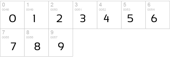
Aug 08, 2022What I particularly like about this font is its number 4 is open at the top, so that it can't be mistaken for a number 9.
Also it's the same height (or nearly) as Arial etc, so that it doesn't make a document take up more lines than a usual font would.
This font has 3 forms on FontZone, being light, regular, bold - please note that if you download all 3, then your PC (if it's like my Windows one) will put all 3 into 1 font-location and, although you'll be able to choose the Bold by clicking on your usual bold icon, you won't be able to choose between the light & the regular (which sucks, but it's not FontZone's fault but the PC's fault) and the Windows PC defaults to the Light font -
so if you want to be able to use the Regular font, you have to NOT download the Light font.
TJfromBrumEngland
Aug 08, 2022What I particularly like about this font is its number 4 is open at the top, so that it can't be mistaken for a number 9.
Also it's the same height (or nearly) as Arial etc, so that it doesn't make a document take up more lines than a usual font would.